Friday, February 22, 2013

Stieglitz!

I'm not a huge fan of Alfred Stieglitz's work, but my friend Chris is.  When he asked for a painting, I figured I'd try to paint him one of Stieglitz's photographs.  Or, I suppose, my interpretation of a Stieglitz photograph.  This is the one I chose:


I liked the contrast of the natural-looking clouds and sky with this obvious 'alien' object that doesn't look like it belongs.  The dirigible immediately draws your eye yet somehow also manages to make the rest of the image look more interesting.  There's a menacing, ominous feel to this photograph, and the dirigible specifically.  I also really liked the bright, middle region of the photograph.  
 
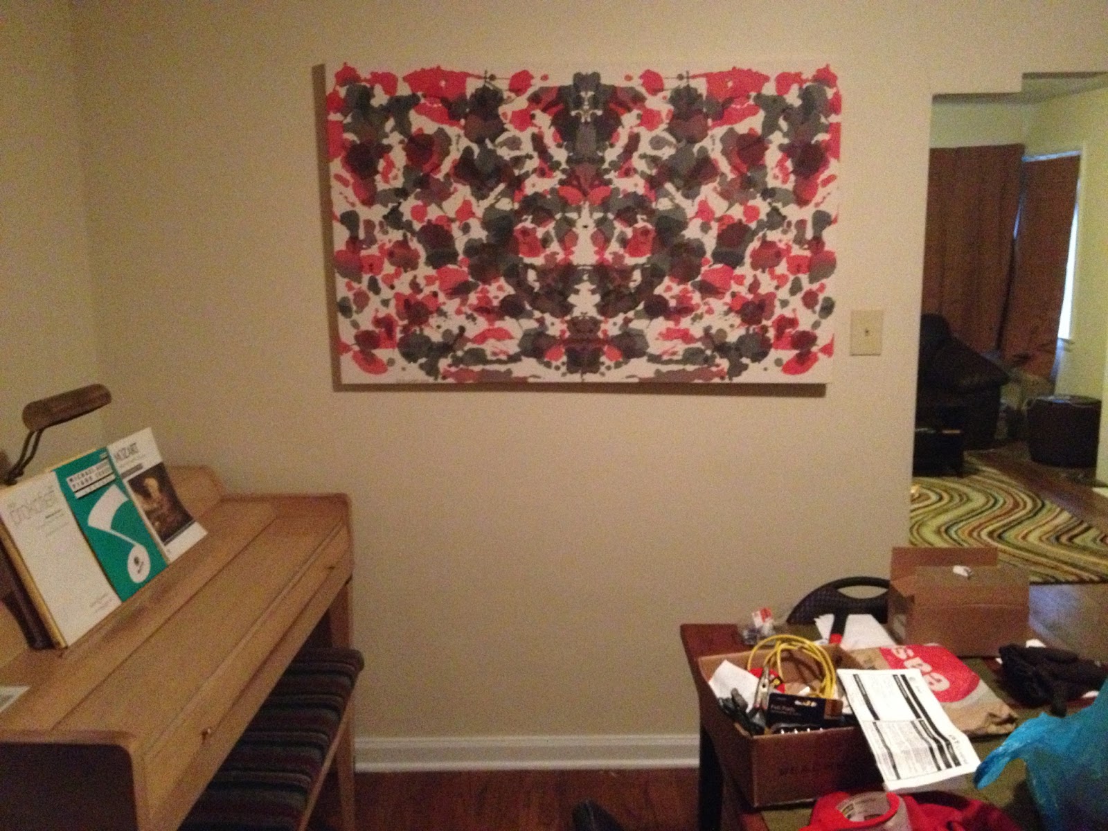
Anyway...his living room is mostly black and white and overall pretty neutral.  There's no bright posters on the walls or neon green furniture or anything like that, so I didn't want to mess with the feel of his place.  I wanted to paint something neutral but intriguing since he doesn't have a lot of stuff hanging up; I figured a Stieglitz-based painting would work well.

Here's the wall I was working with, in the living room above the couch:


As with most paintings, I had no solid idea of how the piece was going to develop, but the first step is to get started!  I decided to use unprimed canvas and apply several layers of stain to build up a background, and then add thicker paint for detail at the end.


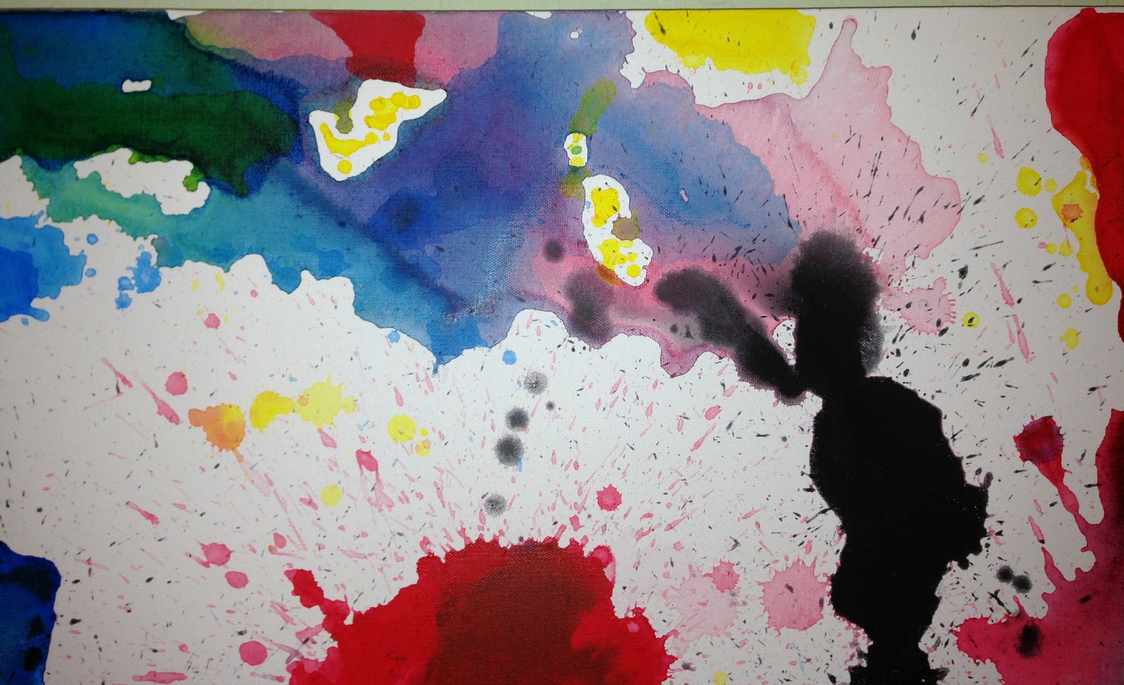
Here are a few of the staining steps, each time getting darker and more detailed.  I essentially just soaked the canvas in water, then applied a paint/water mixture to start building up areas of light and dark.


After I was happy with the stain, I started adding the thicker paint to the canvas.  I mixed the paint with matte medium to thin it and remove the gloss.  Using a plastic knife, a spray bottle, paint, and liberal amounts of water, I began to add more detail to the regions I had defined with the stain.  

A small amount of medium yellow was added to the white and a small amount of white was added to the black - there's no pure black or white in the photograph and I wanted to reflect that.  

In addition, the matte medium and the yellow paint gave the painting an 'old photograph' feel, removing the gloss and aging the color.

Using a very wet canvas with the thicker paint led to a lot of 'bleeding'; this created a blurry, out-of-focus effect that I was copying from the original photograph. 

Here are a couple of the steps.


Now, I just need to add the dirigible and it's finished!  Unfortunately, this step took about two months, trying to figure out exactly how I wanted it to come out.  Chris was very patient.  The dirigible had to be noticeable, but also needed to blend in with the clouds and sky.  I tried various forms of paint and charcoal before getting one I was happy with.  


The Dirigible, 2013, 32 x 44 inches, acrylic, matte medium, and water on canvas


Detail


Final resting place in his living room.

Saturday, January 19, 2013

Christmas presents 2012

I made these for my family as Christmas presents.  Since they all live 1,800 miles away, getting them there was tricky.  I painted all the canvases at home in Scottsdale, rolled them up in large poster tubes and checked them as luggage on the plane.  I had the stretcher bars delivered to my parents' house and then stretched the canvas in Columbus.  It took a couple of days, but was definitely worth it.  I used Gallery Pro stretcher bars, and was happy with the price and wood quality - out of the 28 bars, none were broken or warped.

I wanted there to be a recurring theme for all of them, but for each one to also have its own individuality.  The theme I used was the Rorschach inkblots.  The idea behind the Rorschach inkblot test is to show an image which may or may not suggest a particular picture or idea, and then let the subject you are evaluating tell you what they see or what feelings they have as a result of looking at the inkblot.

The Rorschach inkblots are all symmetric about a vertical axis, so I used this feature in the paintings.  Also, I used only a light coating of white paint and water (instead of gesso) to try to maintain a parchment-type feel to the raw canvas.  In order to imitate ink, I heavily-diluted the acrylic paint and pressed it hard into the canvas, ensuring that there was no thickness to the end result.  

I have specific titles for these, but if I said what they were, it would defeat the purpose, right?


For Mike and Emma

2012, 34 x 54 inches, acrylic on canvas


In their living room


For Daniel and Noelle
2012, 34 x 54 inches, acrylic on canvas


In my brother's office


For Hannah
2012, 34 x 54 inches, acrylic on canvas


In her bedroom


For Holly and TJ

2012, 34 x 54 inches, acrylic on canvas


Location undecided.


For Mom and Pop
2012, 34 x 54 inches, acrylic on canvas


In the sun room


For Tobin and Lisa
2012, 34 x 54 inches, acrylic on canvas


In their living room


For Joel and Rachel
2012, 34 x 54 inches, acrylic on canvas


In their lake house bedroom

Beauty in tragedy

The images of the Challenger explosion are very interesting to me.  

Since I'm not interested in photo-realism, I just wanted to capture the main ideas/parts of those pictures: a peaceful, deep, blue background, an explosion of color and movement near the center, and white smoke trails coming into and out of the field of view.  I used several different colors in the center to try to give it some depth and intrigue, letting the different layers only partially dry before adding the next in order to get a lot of uneven mixing.


Death of a School Teacher, 2012, 31 x 48 inches, acrylic and water on canvas 


Detail

Butterflies

One of my friends asked for a painting and I decided I was going to try to paint him a butterflyMy first attempt was pretty much a failure.  The butterfly's body (black region) is WAY too big and I hadn't learned how to properly stretch canvas yet, so after I painted it and went to stretch it on the frame, the painted area was too big and the wings and the bottom of the body were cut off.  Oh well, I'll paint over it and use the canvas for something else.  

Butterfly 1, 2012, 26 x 34 inches, acrylic and water on canvas


The second attempt turned out a little bit better.  I saved enough room on the edges to account for the canvas needed for wrapping around the back.  Also, I decided that I didn't want to do a monarch butterfly, so I tried this other, more colorful one.  I heavily diluted the paint so that you could see through each of the different paint layers, in an attempt to give it a feeling of being extremely thin and fragile, like real butterfly wings.


Butterfly 2, 2012, 37 x 37 inches, acrylic and water on canvas 


I got lucky with the color of his walls.


Birds

The top picture is what I was trying to capture with this painting.  I really like how initially the picture looks like just splashes of white and black.  Then you realize it's a flock of birds and your (or, at least my) eyes start running across the image and have a hard time focusing on one specific bird or feature.  This effect reminded me of what Hans Hofmann said the goal was for his "push and pull" technique of painting: essentially, he used different techniques to push and pull your attention around the canvas, trying to keep the viewers' eyes in constant motion.  This picture reminded me of that. 

There's such an amazing energy and depth to it - you can almost hear and feel the flapping of the wings.

I applied about 8 separate layers of paint, from wet and runny to thick, raw acrylic paint - trying to create that depth.  By building up the paint to be very thick, I was trying to give it a 3D aspect, like the birds would actually have.  It didn't turn out exactly as I hoped, but nothing ever does. 

Picture source #14


Snow Geese in flight, 2012, 16 x 20 inches, acrylic on canvas


Detail


Painting on a budget

This was my first foray into stretching my own canvas, which isn't as hard as you might think.  Don't be intimidated; if you paint on canvas, take the time to learn how to stretch it.  

The thing I like about these two pieces is that no matter how you rotate them (as long as you rotate them in opposite directions), they're always mirror images of each other.  This gives a lot of variety and options in hanging them.

Stretching your own canvas is the way to go...it's so much cheaper and you get to customize the dimensions.  I'll probably never buy primed, pre-stretched canvas again.


Vertical
Untitled, 2012, two 18 x 27 inches, acrylic and water on canvas


Horizontal
Untitled, 2012, two 18 x 27 inches, acrylic and water on canvas

Get Up

Unfortunately, I don't have a picture of this after it was finished or even a decent quality picture, but this is it probably 80% done.  I painted this for somebody based on the lyrics from the Barcelona song "Get Up", which she said she liked.  

I painted it on my floor, held up with books and plastic Solo cups.  I stacked books in towers of different heights under the canvas to corral the paint to go (and more importantly, not to go) in certain directions.  The result was a sort of planned/unplanned painting.  It was made to be displayed on a large, empty, white wall.  I tried to keep the paint away from the edges of the canvas - I wanted it to blend into the wall, and give the impression of four stripes/splashes on the wall itself.

I think that geometrical shapes and patterns tend to be kind of relaxing, while the splash and randomness of splattered and poured paint demand attention.  I was trying to combine structure (the alternating black and red stripes) with randomness (the splashes and running in the paint) in order to create some intrigue, attempting to draw the viewers' attention and focus.  

This was supposed to incorporate the whole idea of "get up" from the song, and give energy to her room.  

I was happy with the way it looked when it was finished and hung. 


When Black and Red Collide, 2012, 36 x 60 inches, acrylic and water on canvas

Defocused

Holton Rower has a whole set of paintings that look like they're completely out of focus (http://holtonrower.com/?page=gallery&section=painting&category=focus).  It's a really cool effect and those paintings were the inspiration for this; namely, I wanted to see if I could come close to replicating that seamless, blur effect.  I wanted to keep it very simple and use only a few colors (white, primary blue, phthalo blue, lemon yellow, and medium yellow) and then blend them as smoothly as possible.  

This is the scene from the back porch of a lake house owned by my aunt and uncle (of course, it's not really the actual scene, more of the feeling you get standing out there in the late afternoon).  I was attempting to highlight the water and sky.  Initially, I was going to add an in-your-face, bright, jarring cube in the middle (as the lake house), but never got around to it and now think it would ruin this piece.  It ended up being nice, basic, non-threatening, and kind of peaceful the way it is.  

The first two pictures were taken using flash (showing the effect of the gloss medium).  It took a lot of attempts to get a decent picture because the autofocus on my camera phone couldn't get the right focus.  So, maybe that means I got the desired effect.


Lake House, 2012, 36 x 60 inches, acrylic and gloss medium on canvas 


Detail


To Helen

This I did as a tribute to Helen Frankenthaler after she died in late 2011.  I love her work and her paintings introduced me to the Color Field movement of abstract art.  She's known for staining raw (unprimed) canvas using turpentine and oil paint; mine was done on primed canvas with water and acrylic paint.  I was trying to copy her use of large patches of color with intentional and unintentional mixing in order to create something that "looks as if it were born in a minute."  The goal is to create something that reflects the instantaneous mindset of the artist, avoiding over-thinking and over-working the canvas.  As opposed to a painting by Jackson Pollock, for example, it's supposed to be completely unemotional, and, in my opinion, look raw, natural, and organic.

Frankenthaler's Mountains and Sea is one of my favorite paintings and got me to start thinking seriously about painting and about abstract art (http://www.themasterpiececards.com/famous-paintings-reviewed/bid/71011/Helen-Frankenthaler-Mountains-and-Sea).  

The color and blocking of my painting were based on a version of the play Les Misérables (stage managed by the illustrious Mollie Flanagan) I had seen that day.  I painted it on my floor by pouring paint out of an olive oil dispenser, using stacks of books underneath the canvas to guide the paint and make it run and pool in different directions. 
 
Les Misérables, 2012, 36 x 60 inches, acrylic and water on canvas


Detail


Zebra stripes

One of the things I appreciate most about abstract art is that it suits my inability to draw anything.   

A zebra was the inspiration for this.  The brown areas in the upper left and lower right are supposed to be hooves, the two small, blue areas are the eyes (I actually don't have any idea if zebras have, or can have, blue eyes and I don't really care), and the red area is the mouth.  Of course, nobody would ever know that this was modeled off of a zebra, but that was my idea behind the black and white striping and the splashes of color.  This piece is long and short enough that I think it looks nice hanging in a hallway.  

Pieces like this are ridiculously fun to paint - just a palette and a brush and an afternoon slinging paint.  It's pretty much impossible to make a mistake painting something like this.  That freedom is amazing.

Zebra, 2011, 15 x 60 inches, acrylic on canvas


Detail